Paolo Di Lorenzo
30 Jan 2017 • by Paolo Di Lorenzo
I just released my first R package to CRAN. It’s called usmap and can help you create nice US maps for visualizing countrywide data.
Normally, plotting US maps in R is awkward because Alaska and Hawaii are far from the mainland US. So you either make the rest of the US look small, or omit Alaska and Hawaii entirely.
Here’s an example:
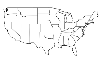
Absolutely disgusting.
Let’s try using usmap:
    library(usmap)
    plot_usmap()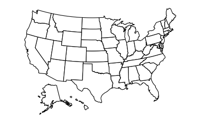
Ah, much better. The map is even drawn using a nicer equal-area projection, rather than the default Mercator that always seems to be used. You can also plot all the counties of the US with this package and select only certain states/counties to be drawn as well. You can see the county map at the landing page I created for this package by clicking here.
The plot_usmap function returns a ggplot object, which means you can very easily change the colors, titles, labels, etc. of the plot. See the mapping vignette for more details.
There are some convenience methods for working with FIPS codes, which is how the states and counties in the package are identified.
    fips("NJ")
    fips("NJ", county = "Mercer")
If you want more information, be sure to check out the Github repository or the vignettes.
    vignette(package = "usmap")
    vignette("introduction", package = "usmap")
    vignette("mapping", package = "usmap")
Feel free to fork the repository and submit pull requests with feature changes and fixes, I’m open to any suggestions. This package was a learning experience for me in creating R packages and starting an open source project. I look forward to maintaining it going forward and implementing great new features.
The code that was used to create these maps was based on this blog post: https://rud.is/b/2014/11/16/moving-the-earth-well-alaska-hawaii-with-r/.